

The grid shows a rich point-in-time snapshot per SKU. The time-series analytics panel adds the history: select a SKU and a full-width panel docks at the bottom of the grid, charting how that SKU’s price, competitor prices, sales, and profit have moved over time. Use it to answer the questions a snapshot can’t: is that competitor price a temporary promo or a sustained reprice? How did sales react to the last price move? Where does the profit-maximizing price sit?

Open and control the panel

  • Open - select a SKU in the grid; the panel docks at the bottom, using the full screen width.
  • Hide / restore - one click on the collapse toggle in the panel header fully hides the panel; one click restores it.
  • Resize - drag the handle to change the panel height.
The header shows which SKU the panel is bound to; selecting a different row re-binds the charts.

Timeframe and aggregation

Two global controls apply to every chart tab:
  • Timeframe - 4, 12, 26, or 52 weeks.
  • Aggregation - Daily or Weekly.
Longer timeframes with weekly aggregation read best for trend questions; short timeframes with daily aggregation are right for promo post-mortems. Each tab also offers more than one layout - use the icons at the bottom of the panel to switch between the chart view and the tab’s alternative views (described per tab below).

The three tabs

Competitor prices

Your price as a flat baseline with competitor prices as stepped lines, plus a My cost reference line. Hover any point for the per-competitor gap on that date.
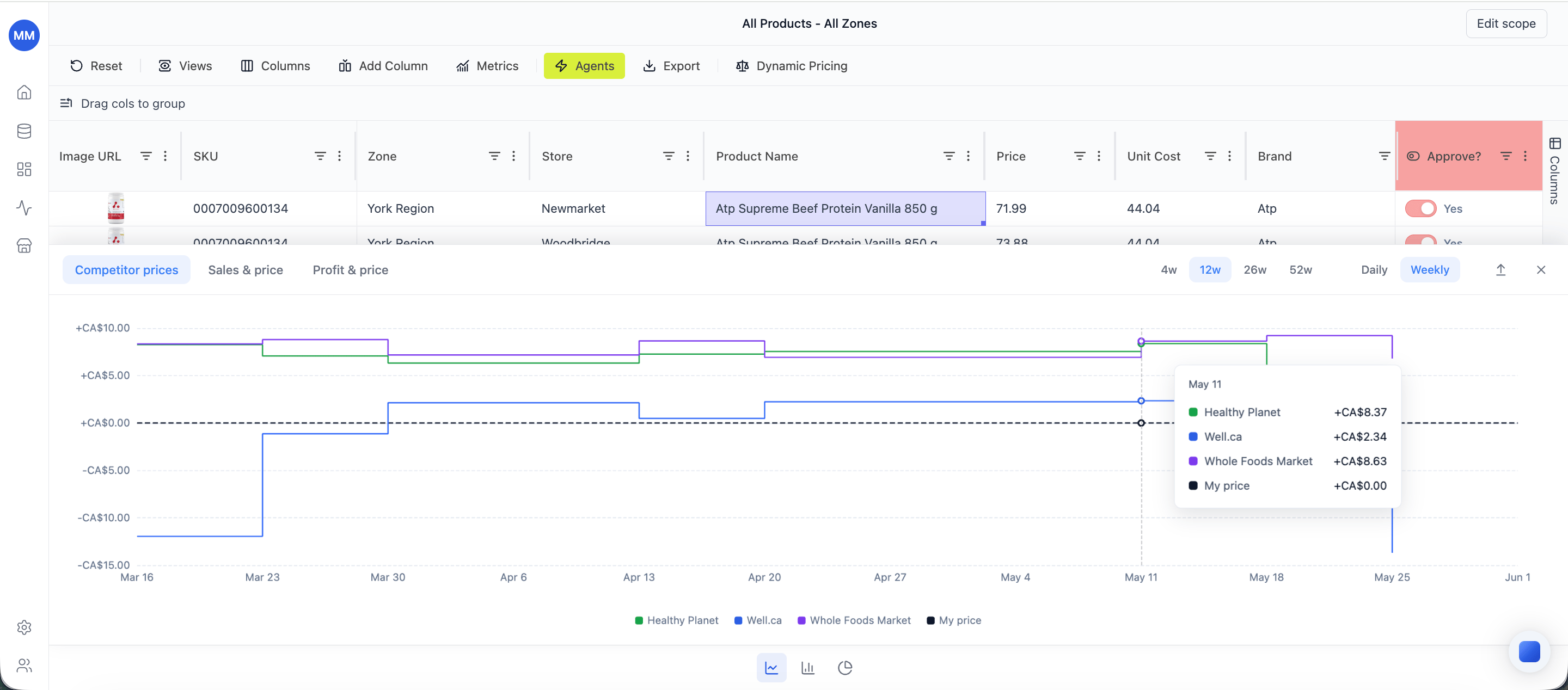
Competitor prices tab - my price baseline, stepped competitor lines, and a per-date tooltip
Dot markers flag two situations worth attention:
  • Promo-driven moves - a competitor price change flagged as a promotion.
  • Below-cost prices - a competitor priced below your cost.
The tab’s table view adds two reads below the chart:
  • Recent price changes - every competitor move in the window, with the old and new price and the gap vs yours.
  • Current ranking - where your price sits against each competitor right now, with a trend sparkline per competitor.
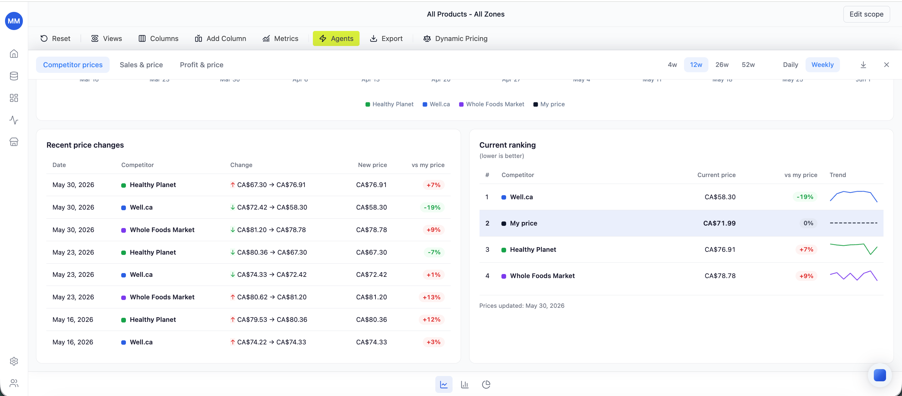
Competitor prices tab - Recent price changes and Current ranking
This is the tab for “is this a promo or a reprice?”

Sales & price

Units sold as bars, with your price and the market average price as lines over the same period. The tooltip surfaces Sales value, Gross profit, and Gross margin % per period.
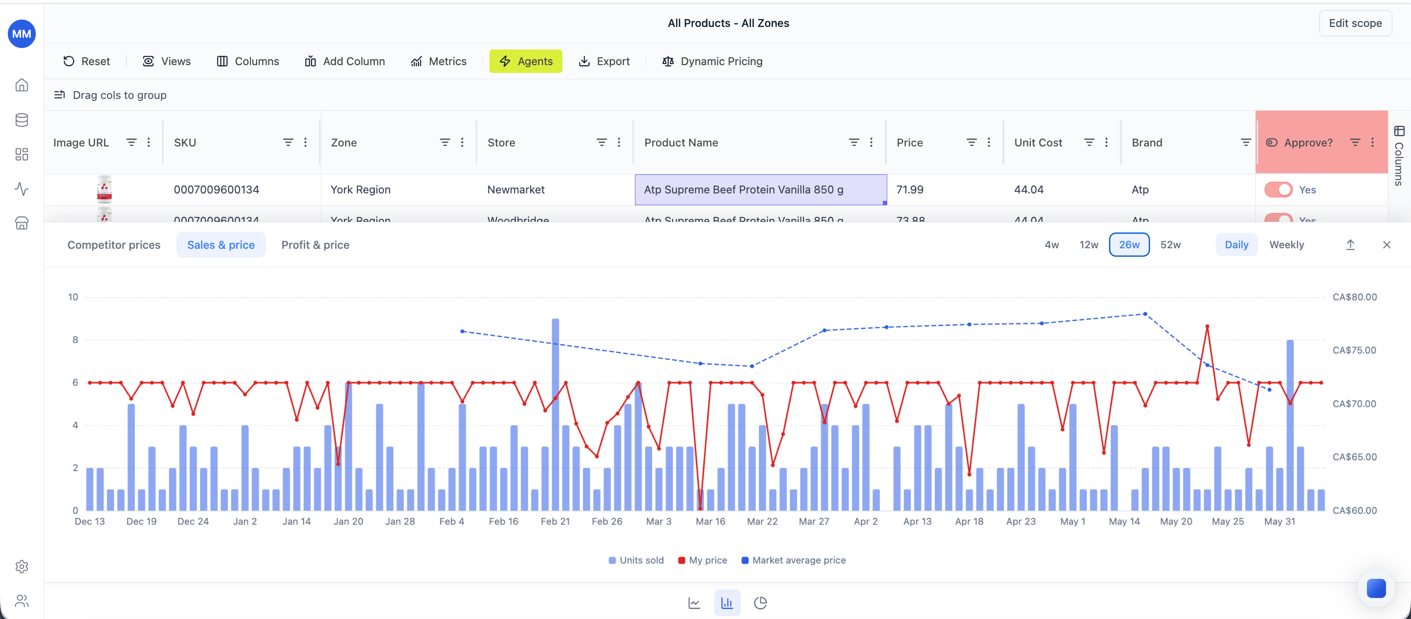
Sales & price tab - units sold bars with my price and market average price lines
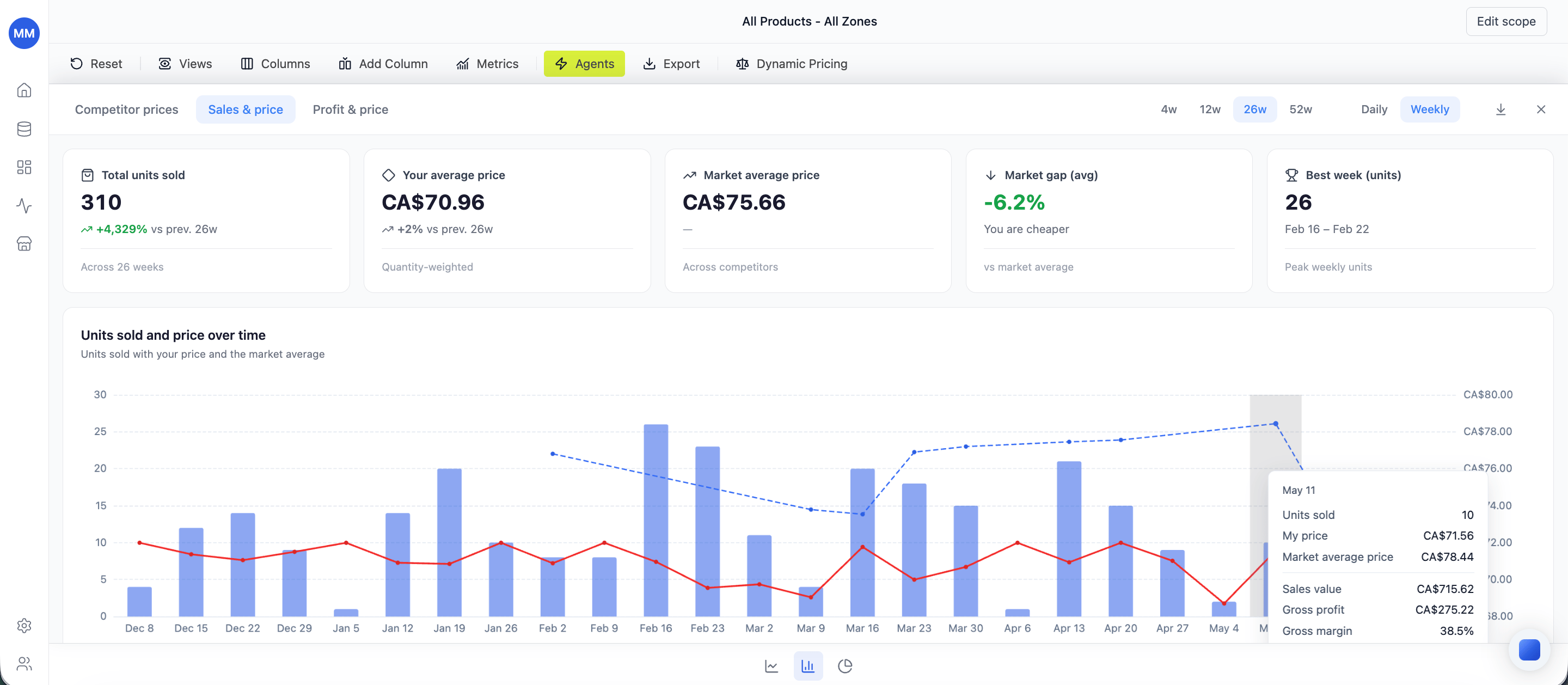
The summary view adds KPI cards on top of the chart - total units sold, your average price, market average price, the average market gap, and the best week by units.
Sales & price tab - summary view with KPI cards above the chart
This is the tab for “what did that price change do to volume and margin?”

Profit & price

Total profit by period, with your price and your cost as reference lines. Hover any bar for the profit, price, and cost on that date.
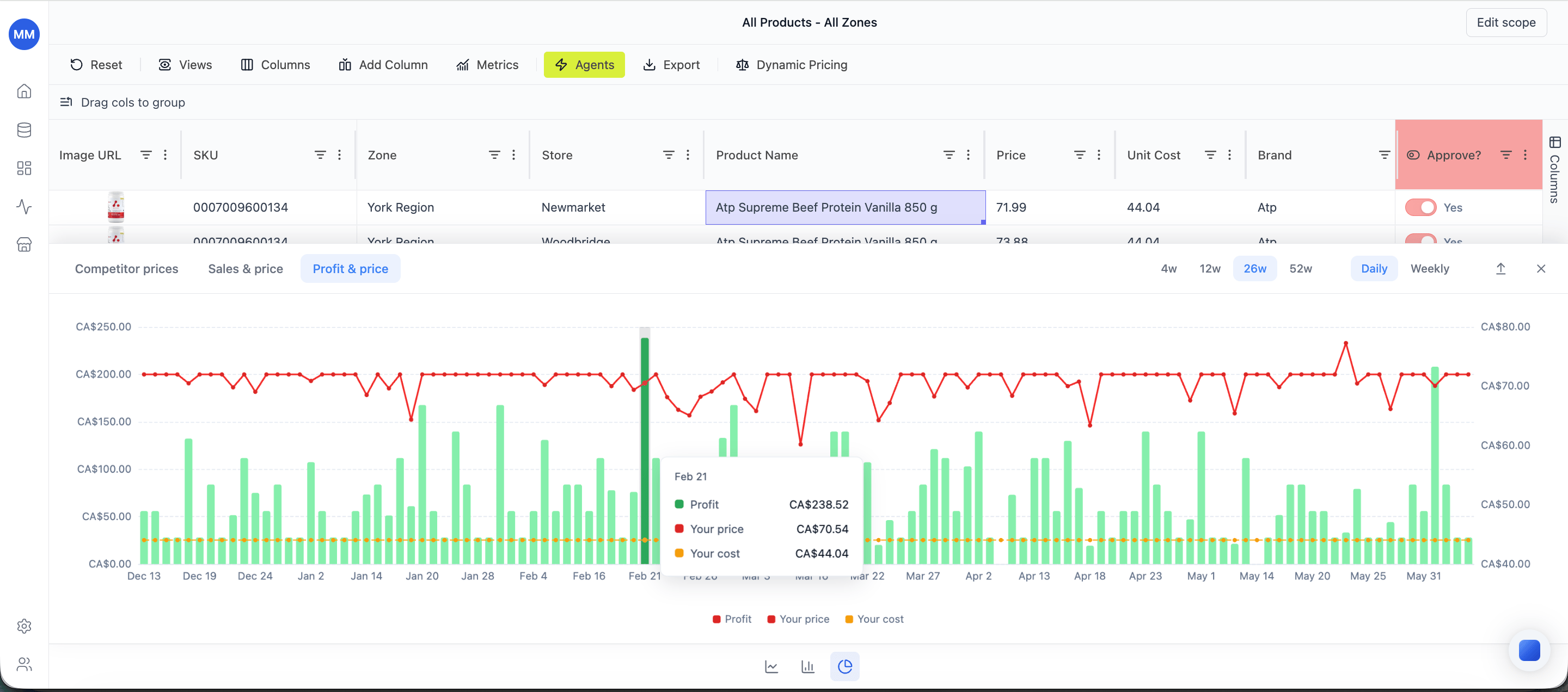
Profit & price tab - profit bars with price and cost reference lines
This is the tab for “are we above or below the profit peak?”

Data requirements

The panel reads per-SKU daily history. For full fidelity you need: SKUs with thin history chart what’s available - a SKU loaded last week won’t fill a 52-week window.