

1. How to add a column
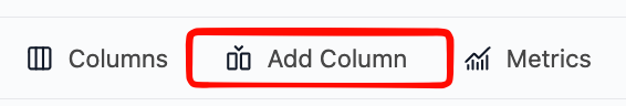
Step 1: Open the Add Column menu
- Click Add Column in the top toolbar.
2. Select column type
You will see four options: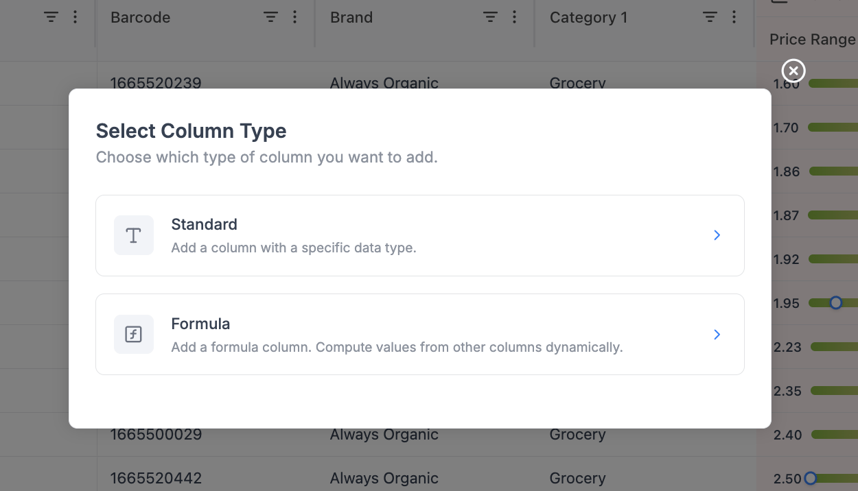
Standard column
- Create a column with a fixed data type
- Used for:
- Notes
- Flags
- Manual inputs
- Tags
Single Select / Status
- Create a column whose values come from a fixed set of choices, each rendered as a colored pill
- Colors are mapped automatically and consistently per value
- Used for:
- Product roles (KVI, Core, Niche, Seasonal)
- Workflow states (Draft, In Review, Approved)
- Risk tiers (Low, Medium, High)
Formula column
- Create a column calculated from other columns
- Used for:
- Margin
- Revenue
- Price differences
- KPIs
Analytical metric
- Pick a single pre-built retail metric (margin, revenue, price index, elasticity, etc.) and choose its timeframe.
- Best for dropping in one extra metric without leaving the Add Column flow.
- For adding several metrics at once - each with its own timeframe - use the dedicated Metrics picker in the top toolbar instead.
3. Standard column
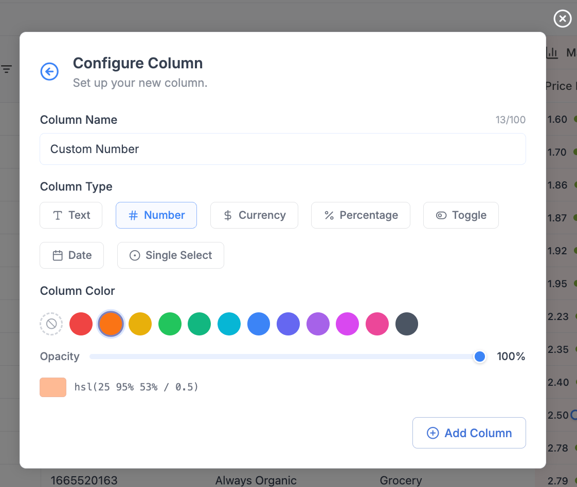
3.1 Column name
- Enter a clear name (e.g.
Margin,Discount %,Notes) - Limit: 100 characters
3.2 Column type / display format
Choose how values should be interpreted:| Type | Use Case |
|---|---|
| Text | Notes, labels |
| Number | Quantities, counts |
| Currency | Prices, revenue |
| Percentage | Margin, discount |
| Date | Events, timestamps |
| Toggle | Yes/No flags |
3.3 Column color (optional)
- Assign a color for quick visual grouping
- Useful for:
- Custom fields
- KPI highlighting
- Workflow states
4. Single Select / Status column
The Single Select column type renders each value as a colored pill, with colors mapped automatically and consistently to values.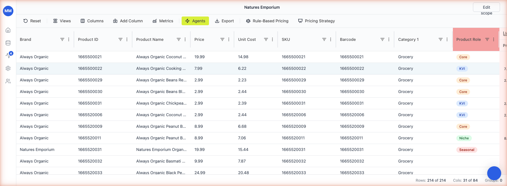
4.1 How it works
- Type or pick a value in the cell. Existing values are offered in a dropdown; new values are accepted on the fly.
- Each unique value is assigned a color from a fixed palette. The same value always gets the same color across the grid - so KVI is always blue, Core is always orange, and so on.
- The mapping persists across reloads. You don’t configure the colors manually.
4.2 When to use it over Standard - Text
Use Single Select when the value space is bounded and you want at-a-glance grouping. Use Standard - Text for free-form notes where every cell is unique. Good Single Select use cases:- Product role (KVI, Core, Niche, Seasonal, Promo)
- Workflow status (Draft, In Review, Approved, Rejected)
- Risk / priority tiers (Low, Medium, High)
- Source channel (Online, Store, Both)
4.3 New values
When you type a value that hasn’t appeared in the column before, Retailgrid adds it to the dropdown and assigns the next available color. There’s no separate “manage values” screen - just typing creates the value.5. Conditional color highlighting
Conditional color highlighting drives a cell’s color from a formula result or a value condition - similar to conditional formatting in Excel. Use it to make at-a-glance grids: green for high-margin SKUs, red for products below the margin floor, blue for KVIs.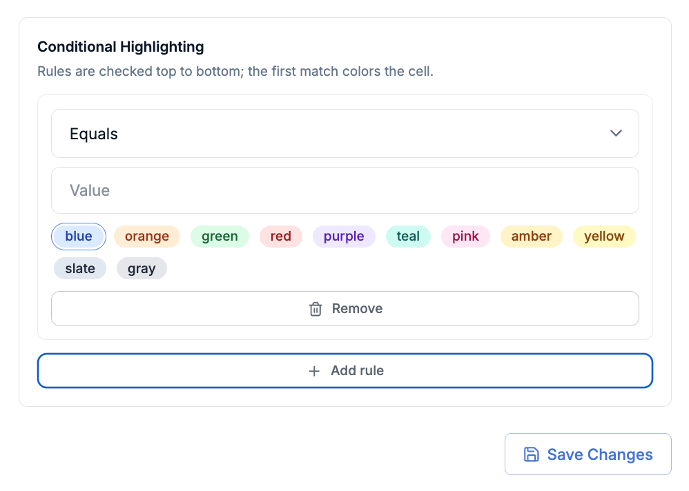
5.1 When to use it
Conditional highlighting is most useful when the value that drives the color is derived rather than set by a person. If a column already stores a bounded set of values you maintain by hand (KVI / Core / Niche), prefer a Single Select / Status column - the colors come for free and the pill UI is clearer than a tinted cell. Pick conditional highlighting when:- The color should follow a formula result that updates as inputs change (e.g. margin tiers).
- The same condition needs to apply across many cells or rows.
- The classification logic lives in a formula that you might iterate on later.
5.2 How to configure
- Open the column header’s three-dot menu on the column whose colors you want to drive.
- Choose Conditional color highlighting.
- Map each value or formula result to a color. Retailgrid offers the same palette used by Single Select columns.
- Preview the result on the visible rows, then save.
"High Margin" and "Low Margin") or directly from a formula column. The most common pattern is the formula route - use an IF() to classify a row, then map the classification to a color.
5.3 Worked example - margin tiers
Add a formula column calledMargin Tier:
Margin Tier and map:
High Margin→ greenMid→ greyLow Margin→ red
{Margin} changes.