> ## Documentation Index
> Fetch the complete documentation index at: https://docs.retailgrid.io/llms.txt
> Use this file to discover all available pages before exploring further.
# Add columns
> Add custom standard, formula, single-select, or analytical-metric columns to your grid for notes, calculations, status pills, margin analysis, and more.
The **Add Column** feature allows you to create custom fields directly in Retailgrid. You can add manual columns for notes or inputs, single-select columns with auto-colored value pills, calculated columns that automatically compute values using formulas, or analytical-metric columns that draw from a curated library of pre-built retail metrics.
This makes Retailgrid flexible for pricing analysis, margin calculations, data enrichment, status tracking, and operational workflows.
 ## 1. How to add a column
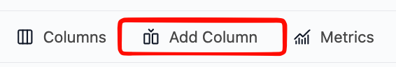
### Step 1: Open the Add Column menu
* Click **Add Column** in the top toolbar.
## 2. Select column type
You will see four options:
## 1. How to add a column
### Step 1: Open the Add Column menu
* Click **Add Column** in the top toolbar.
## 2. Select column type
You will see four options:
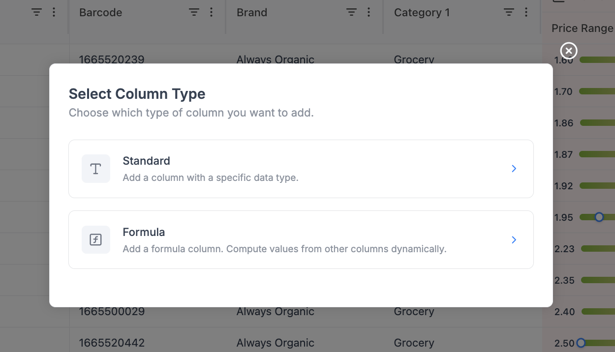 ### Standard column
* Create a column with a fixed data type
* Used for:
* Notes
* Flags
* Manual inputs
* Tags
### Single Select / Status
* Create a column whose values come from a fixed set of choices, each rendered as a colored pill
* Colors are mapped automatically and consistently per value
* Used for:
* Product roles (KVI, Core, Niche, Seasonal)
* Workflow states (Draft, In Review, Approved)
* Risk tiers (Low, Medium, High)
### Formula column
* Create a column calculated from other columns
* Used for:
* Margin
* Revenue
* Price differences
* KPIs
### Analytical metric
* Pick a single pre-built retail metric (margin, revenue, price index, elasticity, etc.) and choose its timeframe.
* Best for dropping in one extra metric without leaving the Add Column flow.
* For adding several metrics at once - each with its own timeframe - use the dedicated [Metrics picker](/grids/metrics) in the top toolbar instead.
Choose **Standard** for manual input, **Single Select** for status / categorical pills, **Formula** for custom calculations, or **Analytical metric** for ready-made retail KPIs.
## 3. Standard column
### Standard column
* Create a column with a fixed data type
* Used for:
* Notes
* Flags
* Manual inputs
* Tags
### Single Select / Status
* Create a column whose values come from a fixed set of choices, each rendered as a colored pill
* Colors are mapped automatically and consistently per value
* Used for:
* Product roles (KVI, Core, Niche, Seasonal)
* Workflow states (Draft, In Review, Approved)
* Risk tiers (Low, Medium, High)
### Formula column
* Create a column calculated from other columns
* Used for:
* Margin
* Revenue
* Price differences
* KPIs
### Analytical metric
* Pick a single pre-built retail metric (margin, revenue, price index, elasticity, etc.) and choose its timeframe.
* Best for dropping in one extra metric without leaving the Add Column flow.
* For adding several metrics at once - each with its own timeframe - use the dedicated [Metrics picker](/grids/metrics) in the top toolbar instead.
Choose **Standard** for manual input, **Single Select** for status / categorical pills, **Formula** for custom calculations, or **Analytical metric** for ready-made retail KPIs.
## 3. Standard column
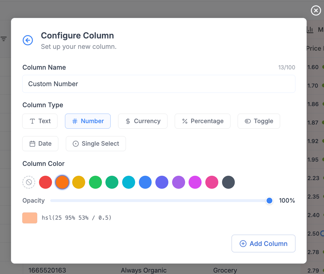 ### 3.1 Column name
* Enter a clear name (e.g. `Margin`, `Discount %`, `Notes`)
* Limit: 100 characters
### 3.2 Column type / display format
Choose how values should be interpreted:
| Type | Use Case |
| :--------- | :----------------- |
| Text | Notes, labels |
| Number | Quantities, counts |
| Currency | Prices, revenue |
| Percentage | Margin, discount |
| Date | Events, timestamps |
| Toggle | Yes/No flags |
### 3.3 Column color (optional)
* Assign a color for quick visual grouping
* Useful for:
* Custom fields
* KPI highlighting
* Workflow states
## 4. Single Select / Status column
The Single Select column type renders each value as a colored pill, with colors mapped automatically and consistently to values.
### 3.1 Column name
* Enter a clear name (e.g. `Margin`, `Discount %`, `Notes`)
* Limit: 100 characters
### 3.2 Column type / display format
Choose how values should be interpreted:
| Type | Use Case |
| :--------- | :----------------- |
| Text | Notes, labels |
| Number | Quantities, counts |
| Currency | Prices, revenue |
| Percentage | Margin, discount |
| Date | Events, timestamps |
| Toggle | Yes/No flags |
### 3.3 Column color (optional)
* Assign a color for quick visual grouping
* Useful for:
* Custom fields
* KPI highlighting
* Workflow states
## 4. Single Select / Status column
The Single Select column type renders each value as a colored pill, with colors mapped automatically and consistently to values.
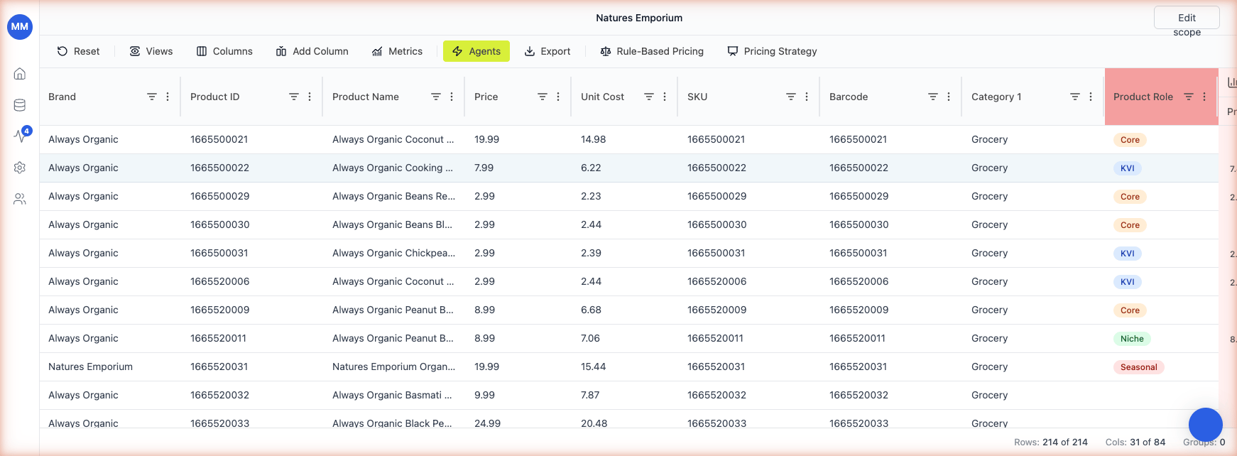 ### 4.1 How it works
* Type or pick a value in the cell. Existing values are offered in a dropdown; new values are accepted on the fly.
* Each unique value is assigned a color from a fixed palette. The same value always gets the same color across the grid - so KVI is always blue, Core is always orange, and so on.
* The mapping persists across reloads. You don't configure the colors manually.
### 4.2 When to use it over Standard - Text
Use Single Select when the value space is bounded and you want at-a-glance grouping. Use Standard - Text for free-form notes where every cell is unique.
Good Single Select use cases:
* **Product role** (KVI, Core, Niche, Seasonal, Promo)
* **Workflow status** (Draft, In Review, Approved, Rejected)
* **Risk / priority tiers** (Low, Medium, High)
* **Source channel** (Online, Store, Both)
### 4.3 New values
When you type a value that hasn't appeared in the column before, Retailgrid adds it to the dropdown and assigns the next available color. There's no separate "manage values" screen - just typing creates the value.
## 5. Conditional color highlighting
Conditional color highlighting drives a cell's color from a formula result or a value condition - similar to conditional formatting in Excel. Use it to make at-a-glance grids: green for high-margin SKUs, red for products below the margin floor, blue for KVIs.
### 4.1 How it works
* Type or pick a value in the cell. Existing values are offered in a dropdown; new values are accepted on the fly.
* Each unique value is assigned a color from a fixed palette. The same value always gets the same color across the grid - so KVI is always blue, Core is always orange, and so on.
* The mapping persists across reloads. You don't configure the colors manually.
### 4.2 When to use it over Standard - Text
Use Single Select when the value space is bounded and you want at-a-glance grouping. Use Standard - Text for free-form notes where every cell is unique.
Good Single Select use cases:
* **Product role** (KVI, Core, Niche, Seasonal, Promo)
* **Workflow status** (Draft, In Review, Approved, Rejected)
* **Risk / priority tiers** (Low, Medium, High)
* **Source channel** (Online, Store, Both)
### 4.3 New values
When you type a value that hasn't appeared in the column before, Retailgrid adds it to the dropdown and assigns the next available color. There's no separate "manage values" screen - just typing creates the value.
## 5. Conditional color highlighting
Conditional color highlighting drives a cell's color from a formula result or a value condition - similar to conditional formatting in Excel. Use it to make at-a-glance grids: green for high-margin SKUs, red for products below the margin floor, blue for KVIs.
 ### 5.1 When to use it
Conditional highlighting is most useful when the value that drives the color is **derived** rather than set by a person. If a column already stores a bounded set of values you maintain by hand (KVI / Core / Niche), prefer a **Single Select / Status** column - the colors come for free and the pill UI is clearer than a tinted cell. Pick conditional highlighting when:
* The color should follow a formula result that updates as inputs change (e.g. margin tiers).
* The same condition needs to apply across many cells or rows.
* The classification logic lives in a formula that you might iterate on later.
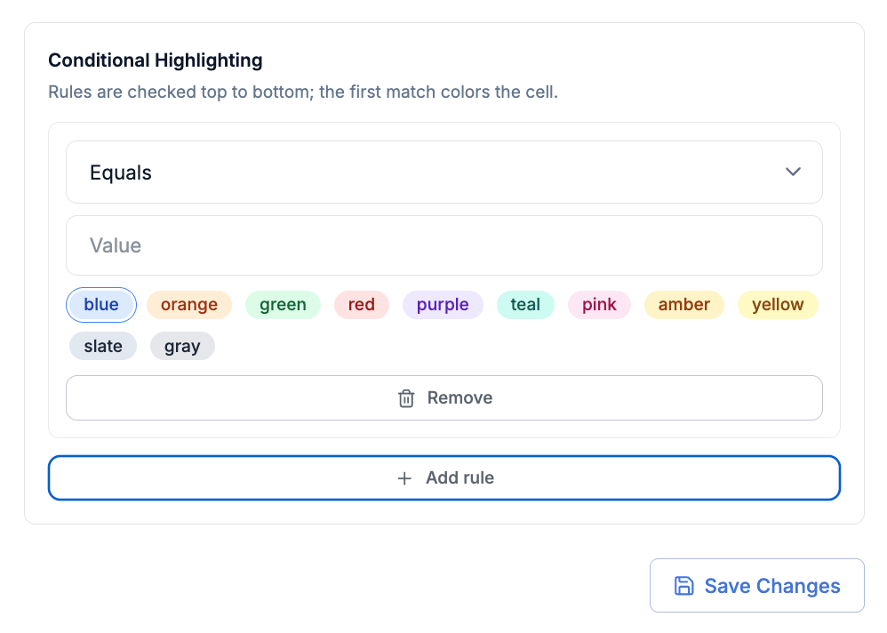
### 5.2 How to configure
1. Open the column header's three-dot menu on the column whose colors you want to drive.
2. Choose **Conditional color highlighting**.
3. Map each value or formula result to a color. Retailgrid offers the same palette used by Single Select columns.
4. Preview the result on the visible rows, then save.
You can drive the color from either a value column (e.g. a string column with `"High Margin"` and `"Low Margin"`) or directly from a formula column. The most common pattern is the formula route - use an `IF()` to classify a row, then map the classification to a color.
### 5.3 Worked example - margin tiers
Add a formula column called `Margin Tier`:
```text theme={null}
IF({Margin} > 0.20, "High Margin", IF({Margin} > 0.10, "Mid", "Low Margin"))
```
Then open **Conditional color highlighting** on `Margin Tier` and map:
* `High Margin` → green
* `Mid` → grey
* `Low Margin` → red
Every row now shows its margin tier at a glance, and the colors update automatically whenever `{Margin}` changes.
### 5.4 Interaction with Single Select
Conditional color highlighting works on any column type. If you apply it to a Single Select column, the conditional rules override the automatic Single Select palette for the values you map. Values you don't map keep their automatic Single Select color.
### 5.1 When to use it
Conditional highlighting is most useful when the value that drives the color is **derived** rather than set by a person. If a column already stores a bounded set of values you maintain by hand (KVI / Core / Niche), prefer a **Single Select / Status** column - the colors come for free and the pill UI is clearer than a tinted cell. Pick conditional highlighting when:
* The color should follow a formula result that updates as inputs change (e.g. margin tiers).
* The same condition needs to apply across many cells or rows.
* The classification logic lives in a formula that you might iterate on later.
### 5.2 How to configure
1. Open the column header's three-dot menu on the column whose colors you want to drive.
2. Choose **Conditional color highlighting**.
3. Map each value or formula result to a color. Retailgrid offers the same palette used by Single Select columns.
4. Preview the result on the visible rows, then save.
You can drive the color from either a value column (e.g. a string column with `"High Margin"` and `"Low Margin"`) or directly from a formula column. The most common pattern is the formula route - use an `IF()` to classify a row, then map the classification to a color.
### 5.3 Worked example - margin tiers
Add a formula column called `Margin Tier`:
```text theme={null}
IF({Margin} > 0.20, "High Margin", IF({Margin} > 0.10, "Mid", "Low Margin"))
```
Then open **Conditional color highlighting** on `Margin Tier` and map:
* `High Margin` → green
* `Mid` → grey
* `Low Margin` → red
Every row now shows its margin tier at a glance, and the colors update automatically whenever `{Margin}` changes.
### 5.4 Interaction with Single Select
Conditional color highlighting works on any column type. If you apply it to a Single Select column, the conditional rules override the automatic Single Select palette for the values you map. Values you don't map keep their automatic Single Select color.